Case Study
Quastels
Project Overview
Law firm Quastels Midgen, a client since 2007, asked Philosophy to rebrand the firm to make it more contemporary and distinct from the competitive set. The firm had decided to shorten its name to Quastels but there was a question mark over whether to position the firm as commercial law specialists or private client specialists, or perhaps both.
Services
Marketing consultancy / Brand identity / Stationery / Business templates / Website / Powerpoint

Following in depth interviews with a range of clients, Philosophy recommended that Quastels position itself around four key service areas in which it had a significant reputation – real estate, trusts, commercial and employment law – while also maintaining its offering to private clients and those who sought support with dispute resolution.
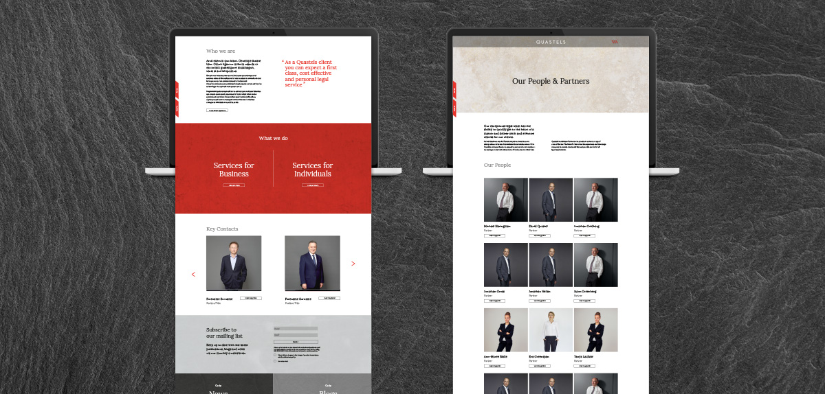
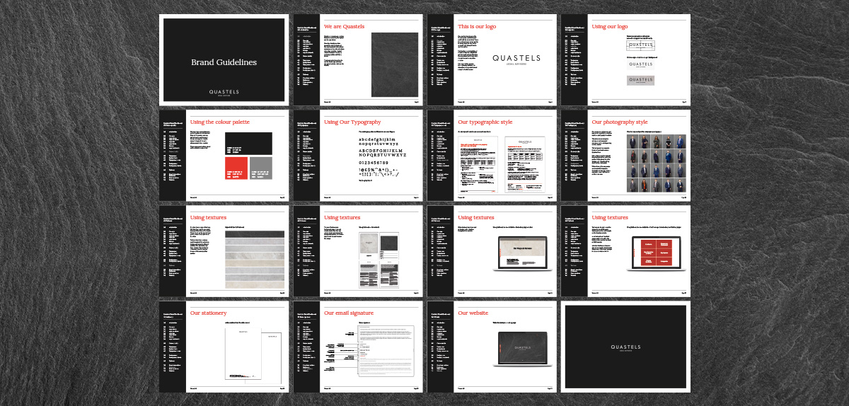
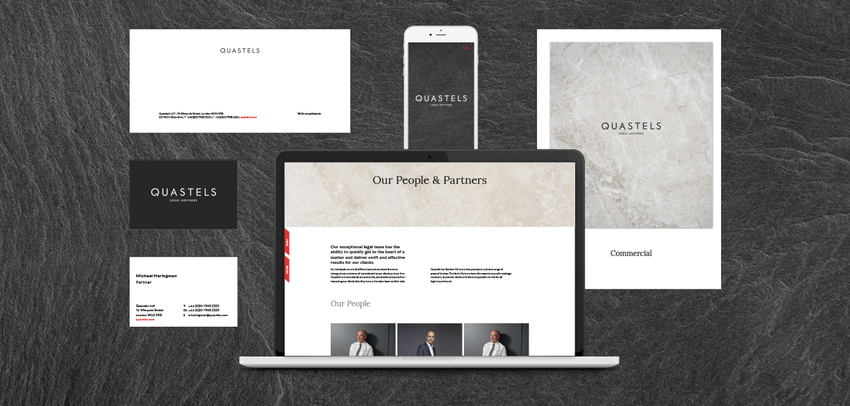
With the key categories of services in place, Philosophy was able to develop a visual brand that communicated a style of service consistent across one and which gave Quastels a more contemporary look and feel. The new brand applied across a new website, as well as the firm’s full suite of stationery templates.